

In my experience, in the early days of the web, a CMS seemed like a utopian idea that didn’t quite work. I was forever hoping that the wonderful new CMS I had found would solve all of my client’s content problems, allowing them to magically add everything themselves. I can still remember the horror of trying to teach 50 staff in a school how to use Joomla.
In the last 5 years, a few CMSs have matured and become solid, realistic tools, that are used by millions. WordPress, Drupal & Umbraco, to name some of the most popular, are all very capable CMSs with competent UIs and highly evolved frameworks that sit behind them.
In my role as a UX consultant, I’m acutely aware of the impact the chosen CMS will have on admin users. All too often a CMS is one of the first decisions made in a project. This can be due to legacy and cost, but often it’s because technology is driving a project rather than its users’ needs. The admin is a user too and their needs have to be factored into the decision when choosing a CMS.
Even with the right choice, a lot of work still has to go into making them truly user-friendly. This involves configuring the fields and options within the CMS UI to make it logical and painless for admins to update the site.
A custom CMS is another option, allowing you to completely build around the needs of all users and the content. However, I’d say the overhead of doing this and the ongoing support needed means it would need to have extremely good justification.
Therein lies the paradox of the CMS:
What do you think?

Why do we do UX? I’d say it’s so that users can have the most hassle-free, seamless experience whilst achieving their goal on a website. So – why should that be any different for the backend CMS users?
I’ve experienced enough CMSs to know that they aren’t the most beautiful things in the world. Typically consisting of text, buttons, and tables with little to no design consideration. I’ve spent the past few years slowly changing and developing the way in which I lay out my fields and have had clients saying how pleased they were at how easy and enjoyable editing the site was. Clients often assume that editing the website is going to be a hard/unenjoyable task for them meaning they often barely try before giving up and coming back to you asking for help.
Here are my top 3 considerations for customising a CMS
Content planning
You must get to know and fully understand your content types before touching the CMS. Don’t be afraid the ask the client questions about their content, e.g. is the content time sensitive? What are the relationships between content? Will the content need to be grouped in any way (think categories/tags)?
Future-proofing
Make sure you get the client thinking about future developments of the content (ideally in the discovery stages). What might change one month/six months/one year down the line? Keep this in mind when planning the CMS and it will reduce the chances of needing to do large refactoring jobs later on. It will also make sure the site is prepared for continuous development (something that should be done, but is often hard if you don’t consider it from the start). You can’t always know what is going to happen in the future, but you can find out what your client’s thoughts are and consider this while building the CMS.
Field grouping
When it comes to actually building the CMS, try to coordinate the backend fields with the frontend design. Now, take this with a pinch of salt as designs change and layouts are becoming increasingly flexible with the rise of responsive design. You don’t want to have to be updating the backend every time you move a button.
What I really mean by this is try to group your backend fields as they are grouped in the frontend. For example, if you have a testimonial panel on one of your projects, don’t just list a ‘name’ and ‘quote’ field along with everything else. Separate that panel out, give it a title (‘Testimonial’), and when the client comes to edit the content they will be able to easily pick out the parts they want to edit.
Keep it simple and descriptive. Ensure the client has the best experience when editing the site. Invest a bit more time in the layout of the fields and in the long run you’ll save time as the client won’t continue to email you on a Friday afternoon. The client is a user, don’t let them have a bad experience.

This is a great topic thanks Ollie, and one that I have a great deal of thoughts on (so brace yourself).
A successful user experience within a CMS I think is associated to four key areas which are aligned to either the platform being used (Umbraco, Sitecore, Drupal etc) or are the responsibility of the consultant configuring the given platform. The success (or failure) of a given project can hinge on the usability of the CMS.
No matter how great the website, if it’s unmanageable or if the administration associated to managing content is so onerous that our client is operationally hamstrung then reputations will be damaged, clients will be unhappy and projects will be deemed unsuccessful.
The four key areas are:
Platform Usability
Some CMS platforms have invested heavily in their usability and UX. It shows.
Take Umbraco and Sitecore for example, both systems are conceptually the same, content is modelled in a similar way, the API’s are similar and terminology (largely) is consistent between the two systems.
However, consider the two images below.
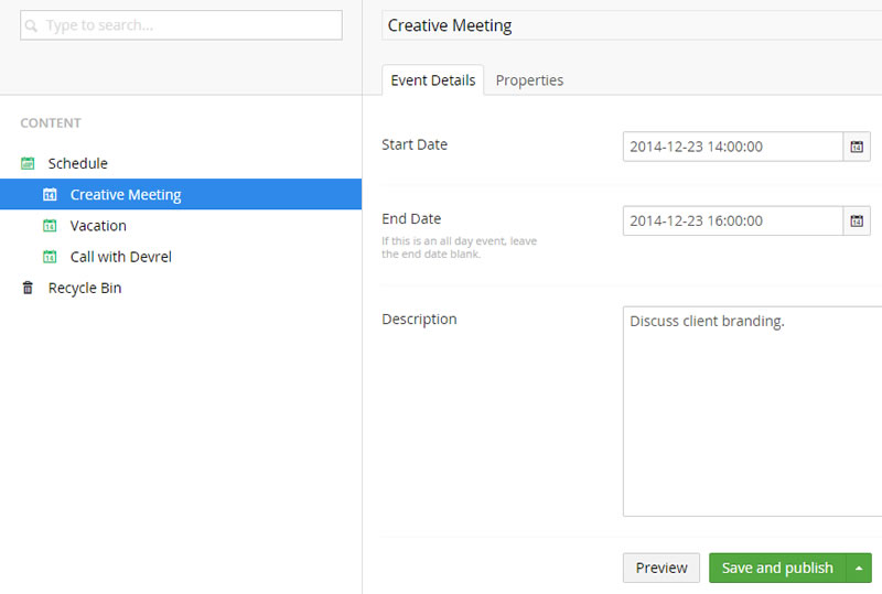
Umbraco CMS Interface
The Umbraco UI is simple and clear.
This isn’t to say that Umbraco is a restrictive, immature CMS; it’s incredibly powerfully, but the UX has been meticulously considered to the extent that Umbraco is a joy to use. Equally training is a breeze, no matter the size of the audience.
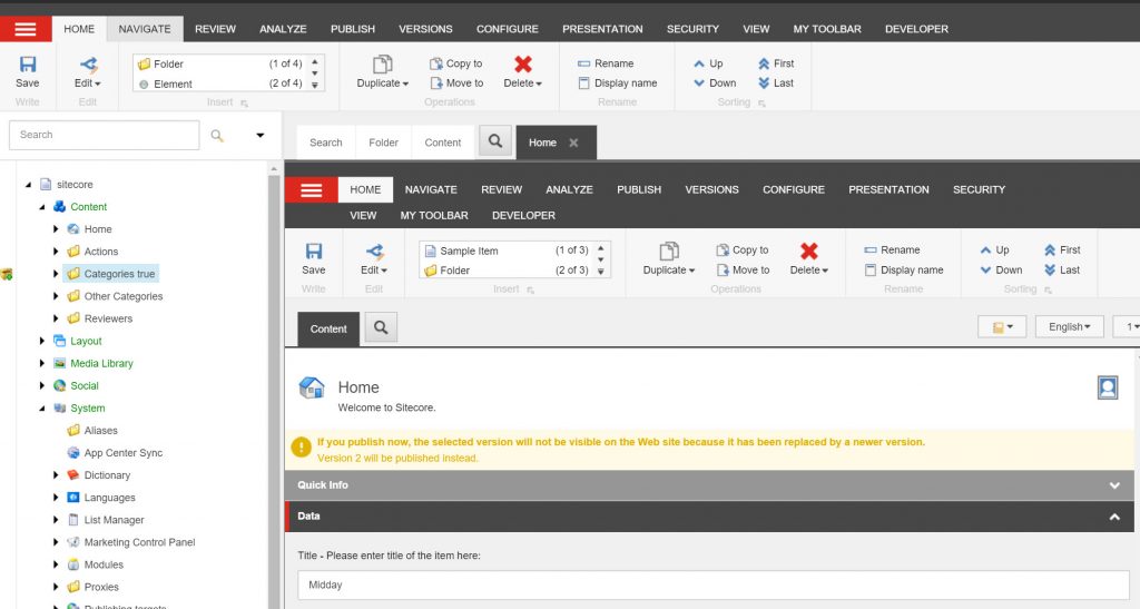
Sitecore CMS Interface
Consider how this contrasts to Sitecore which again is conceptually similar to Umbraco.
It should be said that Sitecore is a considerably more powerful platform, it’s more flexible, scalable and configurable than Umbraco and as such it’s more complex. However it’s through this additional level of flexibility where the usability issues derive from.
Platform Type
I’d like to add to your list of ‘types of CMSs’ if I might dare, as I think the third type is where the sweet-spot lies. I feel that a CMS which proves a successful user experience is one which leverages the maturity and investment of a pre-built CMS but which allows a bespoke CMS to be built on top of it (a hybrid if you will).
Take Umbraco which is incredibly mature, includes a rich API, provides enterprise features such as load balancing and localisation, but which provides nothing to a user out of the box. Upon logging in, the CMS is empty and it requires an expert to configure (from a UX perspective) it correctly. What it does provide out of the box is a framework of building blocks which allows content to be modelled in a way which feels bespoke – it inherently (if configured correctly) matches the content types appropriate to the given website. Equally it’s extensible to allow new features, content types and data types (text editors, media pickers) to be added and customised to suit the current project.
Content Modelling
How content is modelled within the CMS is probably the most important factor which can affect the user experience within a CMS. No matter how great the UI, how powerful the CMS, if it takes a user 45 minutes to create a page and publish it due to the number of steps they need to jump through to do so, then we’ve failed.
For example, imagine a situation where a website contains a blog and a blog is written by an author. When writing and publishing a blog the user needs to enter who the blog’s author is, which provides the following possibilities for content modelling (there are others, but these are the most appropriate here):
1 – De-normalised: Authors could be managed against the given blog page (author’s name, job title, and photo are ‘stored’ against the given blog article), providing ultimate flexibility regarding the author’s name and credentials. In this way, it’s possible to provide more contextually relevant job titles appropriate to the given blog article (a dodgy requirement I know). e.g. A given sales rep at a holiday company could be a ‘Villa Specialist’ on one page and a ‘Greece Specialist’ on another. However, this creates a great deal of duplication, an author may have published multiple blog articles and if the author gets married and their name changes, multiple pages need to be first found and thereafter updated.
Example content model being:
/blogs/blog 1/author 1
/blogs/blog 2/author 2
/blogs/blog 3/author 1
2 – Normalised: Conversely the author could be managed in a separate area of the CMS; a so-called ‘global area’. In this way, an author is picked to be associated with a given blog article. The author’s details are managed in a separate area of the CMS and when updated all articles associated with the given author are published with the new details; updates are quick and easy. However, this is achieved at a detriment to flexibility and less contextually relevant content may be presented to the user (holiday sales reps would have to be ‘sales rep’ on all pages).
Example content model being:
/blogs/blog 1
/blogs/blog 2
/blogs/blog 3
/global/authors/author 1
/global/authors/author 2
Equally, the direction of the picking can cause headaches, or cause a project to succeed, should blogs be picked from the author item, or should authors be picked from the blog items??? Both have their up’s and downs and the decision is relevant to our client’s needs.
Now, considering all of the above challenges it is possible to solve these issues and deliver a beautifully usable CMS, with a few compromises along the way. HOWEVER, content modelling is often left to the developer – not a UX specialist!!! Developers are great n’all (I used to be one), but they are not the best people to be making these decisions; their objectives and goals for the project are different and they’ll largely take decisions to solve their challenges rather than those of the users. I’m paraphrasing to make a point here, not all developers think like this of course, but it’s certainly a problem which occurs more often than not.
Data Types and Extensibility
Website content is natively composed of a collection of words and pictures, each content ‘type’ generally consists of a number of pieces of data. Take a blog article which may contain following pieces of data:
– Blog title: Text string (max 50 chars)
– Blog article: Rich Text
– Blog author: Author Picker
– Blog main image: Media Picker
– Blog published data: Date picker
The data types present within the CMS (e.g. text string, date picker, media picker) are typically limited and are provided by the CMS vendor/community. Additional data types are typically available as plugins and enrich the user experience of a content editor.
It’s probably true to assert the following:
For example, most CMSs provide ‘media pickers’ which allow a media item such as a photo to be picked and associated with a given page in the CMS. However, the ability to upload a new image into the media picker and thereafter pick it in a single action saves a considerable amount of time over a media picker which requires a user to have first uploaded an image into a media library first, prior to it being picked.
Furthermore, the ability to combine data types into ‘aggregates’ provides a synergy with the content modelling process, allowing a much simpler and more easily understandable content model to be developed. For example, take a look at the following page:
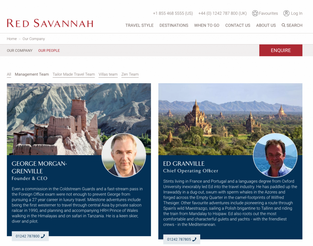
This page lists the management team within a travel company. Without an aggregate data type we’d possibly model our content in the following way:
/homepage/our company/our people/george morgan-grenville
/homepage/our company/our people/ed grenville
This content modelling is great, however in a CMS such as Umbraco or Sitecore, the above model would mean that both employees would have their own ‘page’ and said page would be crawlable by a search engine. Conceptually this also confusing to the admin – “I’m creating a ‘page’ but there’s no actual page to view on the front-end, what the heck!!!”
By creating an aggregate data type we are able to combine the data associated to an employee (name, position, bio, summary, phone number) into an aggregate data type called ‘Employee’ and manage this content within the ‘our people’ people, with no child pages. See the image below which illustrates how this might be applied in Umbraco (a video explains the concept further here).
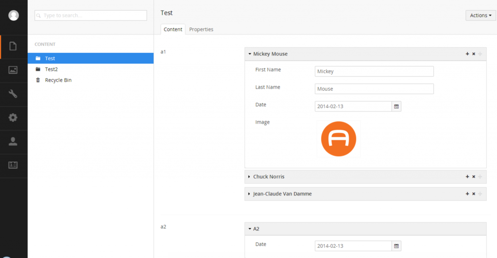
This again provides for a much simpler content model which is easy to understand and manage from the content editors perspective.
To summarise
If you managed to get this far and wade through the barrage of content above then I’d summarise the above in the following way.
A successful user experience within a CMS is dependant on:
N.B. In addition and whilst most of my work is consulting on Sitecore projects these days due to it’s extensive marketing automation and personalisation capability, it’s fair to say that Sitecore falls way short of Umbraco from a UX perspective which (IMO) is lightyears ahead and perfectly provides the capability associated to points 1-3 above.

Since the early days of CMS platforms, whether this be early versions of Drupal, or hand-coded systems, the power that content authors and editors are afforded has increased hugely, but so has the responsibility of the developer implementing or building such a system. Herein though comes the paradox – custom admin interfaces, workflows, and management systems are great but can come with increased development costs, developer reliance, and often ultimately less maintainability of code. How a balance should be considered can be sometimes tricky, but also well achieved with some careful planning. Here are some things I’ve learned to keep in mind when designing the best experiences for Drupal.
Use the CMS wisely
Drupal is a hugely powerful CMS, gone are the days of needing to hack the platform! In nearly all cases, as long as content types are properly configured and set up with a thoroughly designed Information Architecture (IA) as a basis, the CMS will provide all the editability needed. Drupal provides well established paradigms and states for content creation, editing, and deletion processes – don’t work against these, or your code will become defunct as soon as the core methods are changed or updated, and your users will find bugs.
Design fully
Always work from an ideal perspective – yes, Drupal is hugely powerful but it can quickly fall short when using the management side of things. However, with the incredibly powerful theme layer afforded by Drupal, most of these concerns can be addressed in a robust and secure way: consider the admin interface the same way as a frontend consumer theme would be designed, with proper design of interactions, states and then marry this to Drupal. Yes – this is more code, and yes, it’s more bespoke but using established patterns (such as Google’s ‘Material Design’ approach) for your interface, and implementing them with established patterns in the Drupal theme layer won’t be problematic as long as the implementation is done carefully.
Target carefully
When re-skinning or adapting a CMS for content authors, plan everything. As said before – don’t half bake it! If you’re customising the CMS, it makes little sense to rely on default editors or file browsers ‘just because’ it’s easier than alternatives. Using ‘Views’ within Drupal, for example, is one of the most heavily used approaches for rendering dynamic selections of content – and for good reason. The default views renderers and filters though are to this day often unusable on sites with large content bases without some tweaking. If making small adjustments, make sure nothing is missed – or even think about building a full Drupal ‘admin’ theme that covers all areas of the site that an editor might reach, and use this theme to prevent them from accessing any other areas. This will limit your maintenance scope hugely in terms of bugs and enable easier development of future feature requests.
Do it the ‘Drupal’ way
I’m not talking about interfaces here (see my second point!) – but actual coding practices; all too often, I’ve seen core principles of how Drupal treats data ignored and this will always make projects more issue-prone. Yes, working in a specific style of development can seem limiting, and make initial costs seem higher due to the requirement for specialists, but a well built Drupal site can be easily interpreted by other developers if it’s built following the best practices described by the documentation, and uses the well-documented APIs. Customise, but be smart about it – Drupal is probably one of the most well suited CMS platforms to customisation, and if a pattern or solution doesn’t exist for what you want to do, design one, document it, and contribute it back to the community!
Know your workflow
The number one problem I’ve seen when Drupal sites are badly set up for admins/authors is that there was no design for the content workflow, but this is easy, as it can be matched to real-world roles, responsibilities and access permissions. Again, limit the scope of what the users can do to what they need to do, and the maintenance scope is also suddenly easier to manage.
And above all else…
Remember, if the user feels like they’re being given an experience ‘just because’, they’ll quickly learn to loathe the site. And – in most cases, the heaviest power-users of content-driven sites are also key stakeholders; giving them such a feeling is guaranteed to cause frustration on both sides! Customisation and easy maintenance don’t have to be exclusive – using some of the strategies described here will hopefully lead to a site that not only works well, but can be maintained without grief.

I’ve worked with a lot of the people who are eventually going to use these customised CMSs, and time and again the same things crop up.
The key point is that most clients just don’t see content in the way that UXers, designers or developers do. We, as digital types, understand that a page isn’t necessarily a page but is instead made up of 5 different content types. We can mentally map the content from the IA, to the design and then to the set of fields and posts in the CMS. Clients really struggle with this concept, and it’s down to us to figure out how to customise it enough that clients understand what the content relates to in reality (as well as HOW to edit it) but not so much that the CMS becomes messy and complicated technically, as well as overly expensive.
We can minimise confusion by making the editing method for content types consistent
Part of the clients’ confusion comes down to the different content types – clients can’t get their head around the fact that they edit all “team members” as a set of individual content types which are automatically aggregated by the CMS into one ‘page’, but then on the ‘History’ page, they add all of the content via fields on one content type (or post) in one place.
Customisation means that we can enable the client to edit the content in a way that makes more sense to them, and in a method that is more consistent. So that there’s a general understanding that most of the content is edited in a similar way and hence reducing the likelihood of confusion.
We can relate the CMS structure to the frontend
Like Harry mentioned, the more the CMS is organised and labelled as per the frontend of the website, the more the client will understand how fields that are quite conceptual to them, relate to the reality of their website. There is, of course, a balance with this one as you could go as far as customising the entire CMS which would work out very time consuming and unnecessary!
We have to debunk ‘CMS Utopia’
Unfortunately, even with the best CMS, it seems we can never customise enough in the eyes of the client. They always have an impossibly idealistic view of how a CMS can be. Once the interface and tech work has been done, it comes down to the client’s ability to learn how to edit content, and the digital team’s ability to teach them! From experience, the more practically involved the client is throughout the project, the more likely they are to “get” the CMS concept like we do.
UXers and content planners are essential
A full content review, plan and information architecture exercise must be accomplished so that everyone (especially the client) is on the same page with the content detail, type and structure. And in my opinion, as much of the content as possible should be created prior to the CMS creation. That way there are no scary surprises once the CMS is built; we want to avoid situations where lack of involvement means the content doesn’t match the CMS and everyone is suddenly up in arms.
I agree with Janusz that it’s essential the CMS and content are planned between the client, a UXer and the development team. The UXer is the bridge between the client and the team – being empathic to both sets of needs and concerns, and having the skill to come up with the best solution.
Ultimately a CMS done well enough (notice I don’t say perfectly!) gives a good result for everyone – the client is empowered and enabled, so creates great content regularly and becomes a champion in bringing onboard the rest of their team. And the by-product of this is that the design and development team receive far fewer support calls and much more positive feedback.
© UXTail Soup brought to you by Deckchair and friends
A penny for your thoughts...