

Many people come to hate their website. It’s an expensive investment that at first felt like a shiny new premise that represents all you stand for.
Over the days, months and years the website has started to feel like a ghost ship that is slowly floating into oblivion; a place you no longer recommend your customers visit.
But people are still visiting it. The website, as far as many people are concerned, is an accurate representation of your business. It’s alive!
Although the temptation is to discard it and redirect people to your makeshift blog or Facebook page, all is not lost.
This disconnection is common, it’s often because you and your team are so busy growing and developing wonderful new things that the rate of change within your business is not reflected on the website.
If this sounds like you, fear not, the great thing about a website is that it’s not made of stone.
It’s a malleable entity, built out of code and digital parts. While a printed brochure is a static moment in time, a website can be changed.
An important thing to bear in mind is that you feel a lot more emotional about your website than anyone else. Most customers will land, try and get some information or complete a task and then leave. Think about it, as a website user in this day and age you are generally ruthless and pragmatic – ‘I’m here to get some stuff done, get out of my way and don’t waste my time!’
I think it’s a good UX Review. The simple premise is to get an impartial and independent perspective on what’s wrong (and right!) with the website; gather evidence that backs up why it’s not working and learn some pragmatic ways to improve it.
Once you have gained this insight, there are often a myriad of ways to improve your website and make it do what it was designed to do: win you business. Or, if the site really is terminal, you can learn some valuable lessons that can inform what you do when creating your new website.
The beauty of a UX Review is that it enables you to take small steps towards bigger wins.
Rather than immediately assume you have to budget to redo your website, the review informs you on how to make small, time and cost effective changes that will improve the user experience of your website immediately. You can then test these over time and factor in bigger changes later if needed. Generally, you can evolve rather than replace – learning from what you’ve got and iterating, rather than starting from scratch. This saves time, money, stress and effort for the whole team.

We begin with some discovery work with our client to unearth the foundations behind why they feel something is wrong with their website, and who they are as a business:
The reason for doing this is so that we can effectively assess the website against relevant criteria – by knowing their objectives, we know what the website should be achieving from a business point of view. By understanding what their customers need to achieve and how, we can place ourselves in their shoes and test the website as if we were them. And by understanding their competitors, we can benchmark our client’s website against them, to provide comparisons, differences or ideas in the way they approach similar challenges and customers.
Once we have the basic information the review can begin.
The key thing here is objectivity. We’re outside of their business so are far less emotional or biased about the business.
We look at the cold hard facts, as well as imagine ourselves as their customer, both of which are very tricky to do when it’s your own baby.
First, we gather facts from Google Analytics and Mouseflow that show us the statistics around usage of the website; the pages people visit, the order they flow, where they click, how far they scroll and so on. Both provide useful information on the actual journey customers take on the website and how they come to land on the website. This neatly clears up any assumptions our client or we may have – either validating or debunking them.
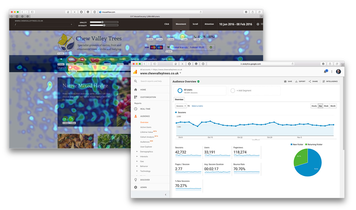
Analytics and Mouseflow reports for a review for Chew Valley Trees
Next, we focus on the customer journeys, using the devices the customers are likely to use. It’s important only to choose a handful of the most critical journeys so that the review can be as helpful to the business-critical actions as possible and doesn’t become overwhelming or too diluted.
We act out each journey step by step as customers, noting down any challenges or positives about our interaction. We’re looking for usability issues (e.g. ineffective buttons) and experience issues (e.g. it’s unclear how to buy the product). For example, on an ecommerce site, a journey is likely to be finding and buying a product. Could we find the product? Was the product information clear? Did the checkout process function well? Was it easy to perform this journey?
Out of this analysis comes a clear and visual report that outlines how the website is performing. We begin with an overview that outlines our discovery findings and what our client hopes to achieve. Then comes the meat of the review.
This is followed by a summary of findings and recommendations that present what we have discovered and the key themes our client needs to work on.
Finally, we like to meet with our client to talk through the review. A document can only go so far; having a discussion between all of us helps to communicate the intricacies and severities of the findings, and more importantly, begin to work out what to do with them.
By the end of the session, everyone is really clear on the current state of affairs, and usually very satisfied.
The review brings clarity to the clients’ concerns and becomes a go-to reference for how to improve the website.
Usually, the review highlights many small tasks that will make a great improvement in the usability and experience of the website without the need for a new website. And at other times where an overhaul is necessary, it provides a great starting point for the new project with clear objectives, requirements and recommendations.
Ideally, we and the client come out of the session with a list of prioritised actions for what to do next.
So from beginning with that sinking feeling of frustration and disillusion, we’ve helped the client get back on track. The review enables the client to be pragmatic and prioritise the problems they want to solve, in a timely and cost-effective manner. Small steps towards bigger wins!
© UXTail Soup brought to you by Deckchair and friends

A penny for your thoughts...